
Vox has a very interesting article on incarceration rates in the United States with regards to race, drug use, and how the U.S. compares to the rest of the world. It also has maps and graphs showing that the amount of time being served has dramatically increased for murder, while remaining fairly constant for other crimes. 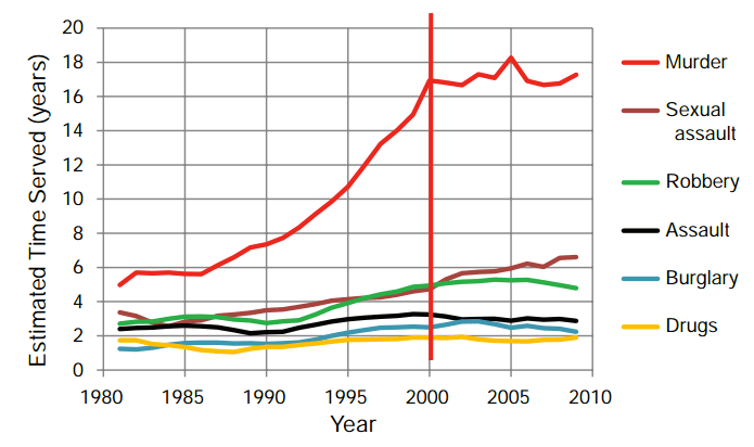
In addition to the above, it’s interesting to see how crime has declined over the years, yet the number of people incarcerated continues to grow:

The most effective thing for me when it comes to the bunches of graphics Vox is sharing on this topic in this article is that they are easy to read for the most part, and the visuals themselves are not complicated. Often times when reading statistics on something as involved as crime and incarceration rates, the stats are presented in a very dry way, and there are only a couple of visuals shown. Vox breaks it down into a variety of different areas, and breaks down what the trends are without having to spend a lot of time following along, which is quite effective in an age where attention spans seem to be shortening all of the time.
