One important thing to note with this inforgraphic is that the data shown above is changing every couple of days, and will not be fully updated until right before Thanksgiving. While most of us tend to think that once election day is over, all ballot counting verification is also over, that is actually pretty far from the truth.
Ballots are verified, and ballots from overseas are not even counted until about eight days after the election.
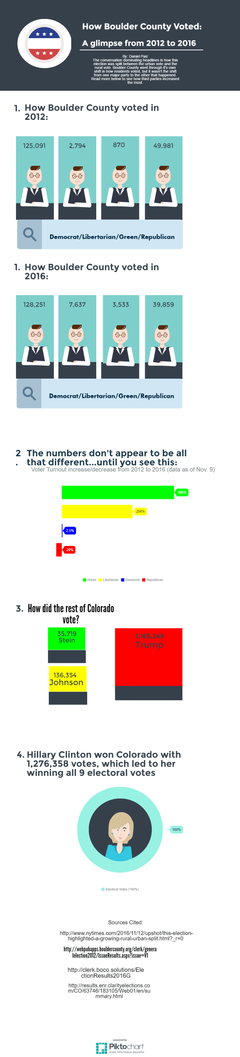
Another important piece of information for this comparison is that in 2013, Colorado changed the way in which voting happens. More ballots were sent out through the mail, voting centers wee open weeks before election day arrived, and fewer actual voting locations existed because of the extended amount of time voters had to turn in mail-in ballots.
Factor that in with the huge population growth in Colorado that has happened between these two elections, and the numbers are going to be fairly different. Still, it is interesting to see how things have shifted in Boulder from 2012 until now.

Hey Daniel, I again appreciate that you included a good explanatory text block with your graphic. That does help us make sense of everything. Having two graphics numbered “1” is a bit confusing. I’d just have one numeral with the two graphics. Also, could you find a different avatar to represent the different parties? Having the same dude, as handsome and smart as he appears, doesn’t distinguish between the groups particularly well. Also, having the labels directly below the avatar, rather than separated by slash marks, would make it a bit easier to read. I agree that # 2 is the most interesting. It would be cool to make an interactive, perhaps with fusion tables or something like that, where viewers could compare the increase or decrease of voters with a certain party to the overall change in votes for that party. The “How the Rest of Colorado Voted” and “Hillary Clinton Won Colorado” portions would be better if they were combined. Some of the text, including in your opening paragraph, are a bit small to be easily read and some of that “Electoral Votes – 100%” aren’t necessary. The 100% teal ring around Hillary’s avatar doesn’t come across as a graphic representation, but instead just looks like a ring around her. The 100% arrow makes sense of that, but perhaps there’s a way to make it work a little more gracefully.